We’ve been Urban Chestnut’s branding and design partner since their first beer was poured! Grab a stein and learn how we helped build and continue to support one of St. Louis’s premier craft breweries.
A Logo that Tells Two Stories
“Urban Chestnut” references the emergence of the modern microbrewery in urban areas (like their original home in Midtown, St. Louis), while paying homage to the shady chestnut trees that cooled the biergartens and cellars of old Bavaria.
Branding Two Distinct Product Lines
Our initial challenge was to build a shelf-popping brand identity with modern appeal and a clear nod to tradition. Thus, the original concept of “Bier Divergency” came to life in two series…
REVERENCE SERIES
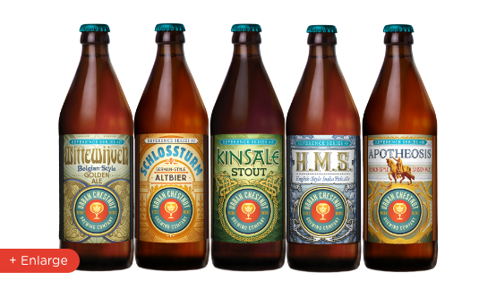
Biers that closely reflect the classical training and 100% Bavarian background of UCBC’s Brewmaster—perfect for a Lager-loving market, primed to accept a new standard of quality. Old-world typography, intricate design elements and bright colors form a design language that celebrates tradition yet stands out from across the store aisle or Bierhall floor.
REVOLUTION SERIES
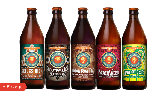
Hazy IPAs, Coffee Stouts, unexpected infusions. These biers push the boundaries of what’s possible with Urban Chestnut’s state-of-the-art brewing processes. Yet, the casual fan of modern craft styles will find as much to enjoy here as some the more adventurous connoisseur. Revolution design language maintains the brand’s authenticity—but is brighter, bolder, more playful than its reverent counterpart.
Design Evolution
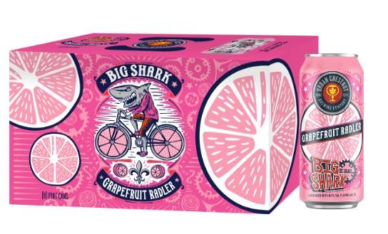
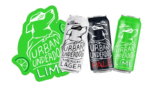
After a while, fan favorites and best sellers began to emerge out of both series. And, as the company was maturing in terms of distribution and reputation, it was time to give the brand a bit of a facelift. With UCBC’s traditional M.O. now firmly established, we pushed the labels and packaging to the next level across the entire product range. The more modern look keeps key brand elements intact while introducing cleaner design language, giving each bier an instantly recognizable color and graphic association.
Craft beer nerds love what Urban Chestnut is all about. With a third brewery location in Wolnzach, Germany (in the hop-rich Hallertau region), UCBC is as real as it gets. But with most artisanal products comes the need for general consumer education. And who better to tell the story—in-store—than the Bavarian Brewmaster himself?
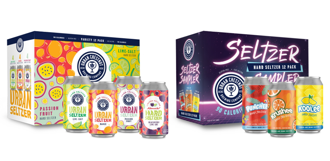
Purist or not, you’ve got to acknowledge that Seltzers have impacted the mainstream in a big way—and the last thing we wanted was for UCBC to get lost in the craze. So, Stealth Creative went super colorful with Urban Seltzer packaging to ensure it would stand out from the monotone branding of competing bubblies, while doing justice to each individual flavor. And check out our tubular approach to selling the totally 80’s flavors found in the special-edition Seltzer Sampler!
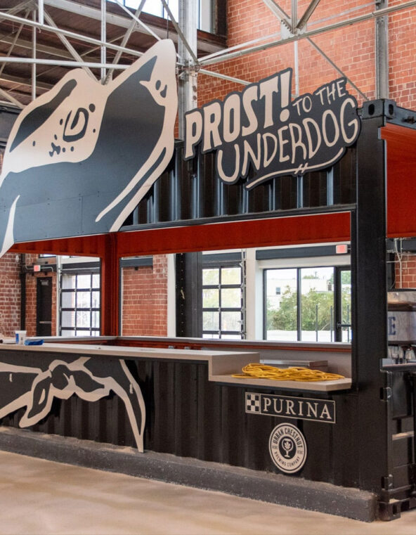
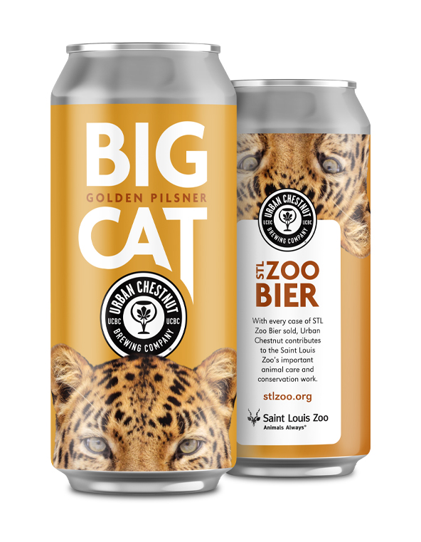
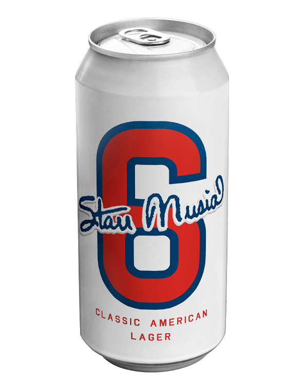
Each campaign, activation and sub-brand needs to shine in its own way, yet still maintain the common threads we established for Urban Chestnut—from our design of the purpose-built bar at BarK (a local dog park/biergarten concept), to helping develop and maintain their St. Louis Zoo sponsorship—and even our collaboration with the family of legendary Cardinal-slugger Stan Musial to brand the seasonal-favorite, #6 Lager.
Urban Chestnut is a St. Louis-based brewer known for their award-winning renditions of traditional German bier styles, as well as their more contemporary and seasonal offerings. We’ve been their go-to branding and design partner since the inception of UCBC in 2011—and have helped them to grow into one of the region’s biggest names in premium “craft” beer.
