You know the saying “It’s what’s on the inside that counts?” That’s far from the whole story, at least when it comes to packaging design.
Just think of the last time you stood in the aisle debating which canned chicken to buy. All things being equal, the can’s label and design probably served as the tiebreaker.
Keep reading to learn which packaging design trends Stealth Creative believes can attract more customers to your brand.
You Are What You Drink
It’s not your imagination: Cans are getting taller and skinnier.
Yes, this is frustrating when you can’t find a snug-fitting coozy. And yes, this trend plays off our subconscious desires.
When we see a slim and sleek can, our brain says “Oh, this must be healthy.” Not only does this satisfy some deep-seated psychology, but it can satisfy your profit margins.
Slimmer packaging also opens more room for your product on retailers’ shelves, which comes with extra benefits like fewer stockouts, lower packaging COGs and more product availability.
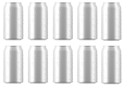
Wide Design
10 facings
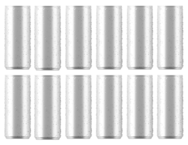
Slim Design
12 Facings
BOTTOM LINE: There are few things more powerful in marketing than understanding your audience on a deeper level—and turning those understandings into appeals to what they value or desire.
Make It Sustainable
Recyclable materials are so 2019. One of the hottest packaging trends today is sustainability.
Yes, there is a difference.
Recyclable means using materials that can be remade into others.
RECYCLABLE
Plastic
Aluminum
Glass
Paper
SUSTAINABLE
Bioplastics
Wood Pulp
Cotton
Hemp
86%
Source: Trivium Packaging
And when sustainability isn’t an option, big brands are taking leaps towards eco-friendly packaging.
Here’s an example: Sprite recently did away with their iconic green bottles—and we assure you that decision was hotly debated before becoming official. The reason? Clear, transparent bottles are more easily recycled. Now, this isn’t as good as being sustainable—more than a billion plastic bottles are used every day. But we can safely say this enviro-focused trend in general is here to stay.
BOTTOM LINE: Many are starting to take the environment more seriously. And if your brand is philanthropic, nature-oriented or “green,” you need to reflect this in your packaging to boost your brand story’s authenticity.
Speaking of sustainable…
Naturally Colorful
If you want to influence behavior (*cough* sell more products *cough*), color needs to be at the top of your consideration list. For instance, there’s a reason you don’t find many nurseries painted psychedelic orange. It’s not very soothing.
The same principle applies to packaging—which is why you’re probably seeing more of this color lately.
You’re probably also seeing more blues, light greens and neutral browns because those say “earth-friendly” or “sustainable.”
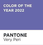
Out of all the packaging design trends, color is probably the most predictable. So, pay attention. Your competition is.
Flashbacks
We don’t know about you, but the past couple of years have been… different. That probably in part explains the upswing in design elements from years past.
Think about it. Retro designs are a backlash. A resistance. These say we want to go back to simpler times with a new face of nostalgia.
Right now, the ’90s are in fashion again. Why? Because the generation that grew up then has more purchasing power… and that decade resonates with them.
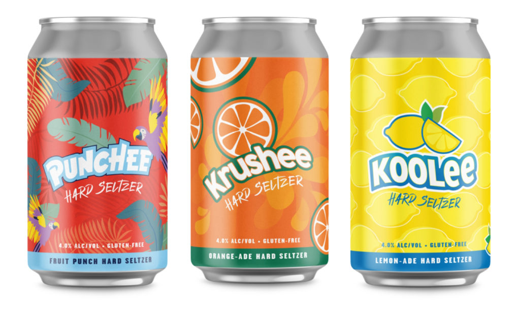
So, when our client Urban Chestnut Brewing Company asked us to create packaging for their new line of seltzers, we took a trip down Memory Lane with cans that give a nod to Lemonheads, Hi-C and other staples from that era.
SHOW, DON'T TELL
Now, you might be saying. “This sounds more expensive and involved.” You’d be right. But there’s a big market for it—especially if you’re trying to reach younger consumers.
Perceived
Freshness
Perceived
Tastiness
Perceived
Quality
K.I.S.S.
How can your product stand out when everything else on the shelf is screaming out?
You strip away the excess and minimize your design as much as possible.
So, what does that look like? Let’s use this RX Bar as an example. Nice and clean, right? This package embodies all the best minimal design elements:
- No-wrap around text. If words are that important, make it easy to read all of them.
- Distill the message. Focus on your single most essential feature or benefit.
- Two high-contrast colors. This is proven to grab attention.
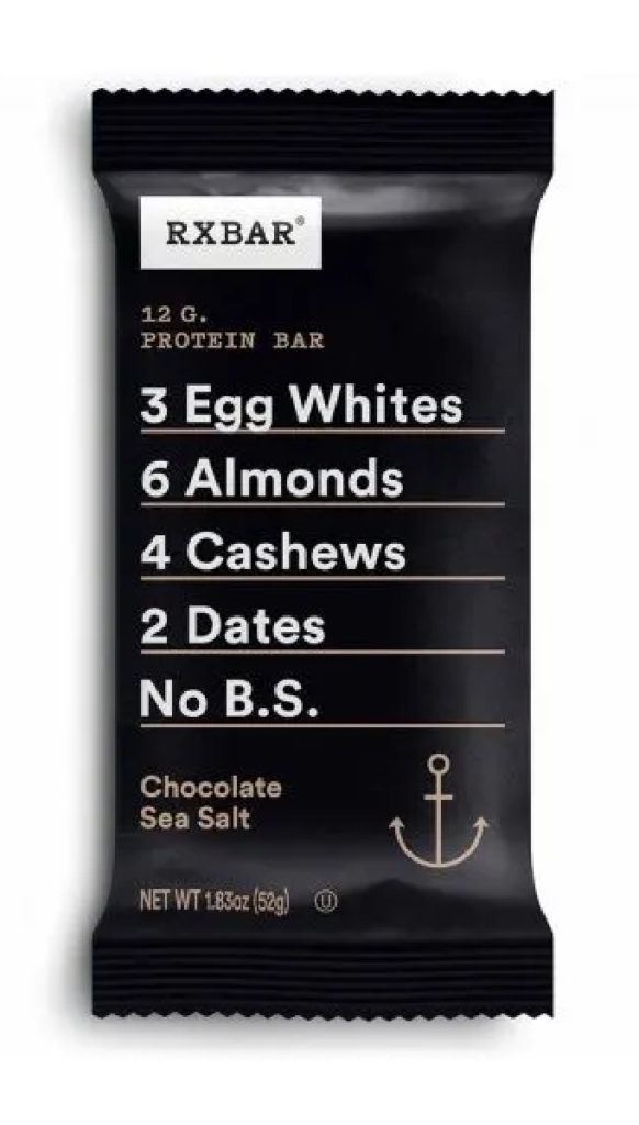
Source: shop.rxbar.com
What trend is your packaging missing?
Our package design specialists at Stealth Creative would love to show what your new packaging could look like. Drop us a line at info@stealthcreative.com!